Brand Guidelines
Meridian is a B2B workflow automation platform built for teams that move fast and need their tools to keep up.
We connect your stack, automate the handoffs between it, and give your team one source of truth — without the ops overhead. Every design decision we make reflects that: precise, purposeful, and never louder than it needs to be.
This document defines how Meridian looks, sounds, and behaves across every touchpoint. It exists to make consistency effortless and to give anyone working with the brand a clear point of reference.
Contents
01 Brand Strategy
02 Personality
03 Logo
04 Color
05 Typography
06 Art Direction
01 Brand Strategy
Meridian exists at the intersection of two things B2B software rarely manages at once: genuine technical depth and a clear point of view. Most automation tools talk about what they connect. Meridian talks about what that connection makes possible — less friction, faster decisions, teams that spend time on work that matters.
The strategic position is deliberate. We're not the cheapest option, the most feature-rich, or the easiest to set up. We're the one that fits exactly the way high-functioning teams already think: systematically, precisely, without patience for noise.

That's the promise the brand has to carry. Every touchpoint — from the product UI to a sales deck to a one-line email subject — should feel like it was written or designed by someone who already understands the problem. Not someone selling a solution to a stranger.
02 Personality
If Meridian were a person, they'd be the engineer who also writes well. They don't over-explain. They don't use three words when one will do. They've already thought through the edge cases before you raise them, and they tell you that without making you feel slow for asking.
They're confident without being loud. Precise without being cold. And they have exactly one moment of personality — the lime — that tells you there's something alive behind all that restraint.
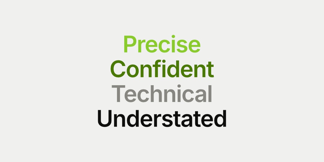
In four words: Precise. Confident. Technical. Understated.
Tone & Voice
Our Vision: why we exist
The voice stays consistent whether we're writing UI microcopy, a case study headline, or an error message. It's always the same person in the room — calm, direct, already three steps ahead.
Our Mission: what we do
Remove the manual work between tools so teams can focus on decisions, not data entry.
Our Promise: how we help
Give every team the operational clarity of one twice the size — without hiring for it.
Sample Copy
Connected by Default. No Setup Theatre.
Most automation tools take a day to configure and a week to trust. Meridian connects in minutes and runs in the background — exactly where automation belongs.
Less Ops Overhead. Same Output.
You don't need a bigger ops team. You need the one you have to stop doing things a script could handle. Meridian is that script — just with a better interface.
We Handle the Logic. You Keep the Credit.
Your team moves fast. The tools between them shouldn't slow that down. Meridian handles the handoffs so your people handle the outcomes.
Automate the work. Own the outcome.
Precision matters when it comes to financial corrections. A small error can have a big impact on your savings, credit score, or future financial goals.
03 Logo
The Meridian mark is a circle bisected by two perpendicular axes with a filled centre point — a geometric abstraction of a meridian line: precise, convergent, purposeful. It references navigation, culmination, and focus.
The crosshair form carries a second meaning in the context of the product. Automation is fundamentally about targeting — identifying the right moment in a workflow, the right data field, the right trigger — and acting on it without hesitation. The mark communicates that instinct visually: everything converges on a single point. Nothing is ambiguous about where the focus is.
The stroke-based construction — no fills, no gradients, just line weight and geometry — reflects the product's technical character. This is not a brand that decorates. It is a brand that draws conclusions.
Primary Lockup
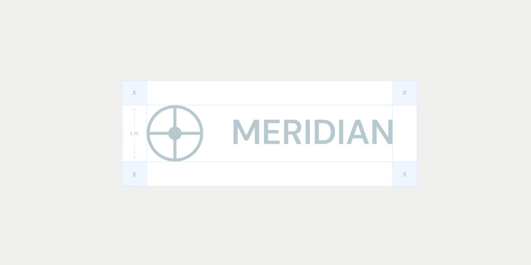
Clearspace
Secondary Lockups
Incorrect Usage
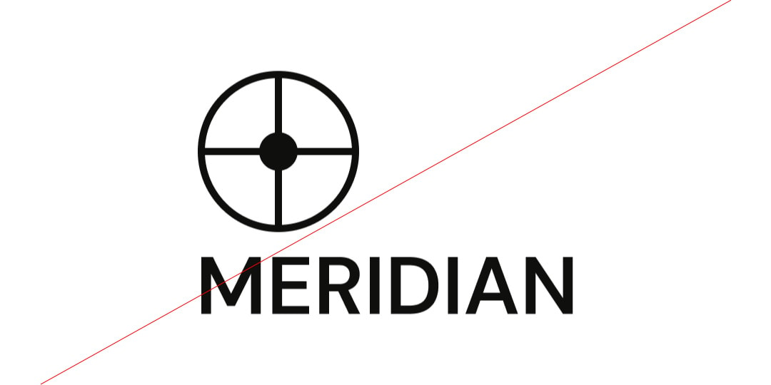

Do not resize the mark
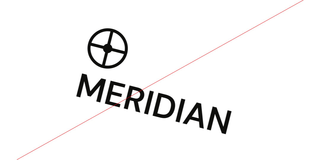
Do not rotate the logo
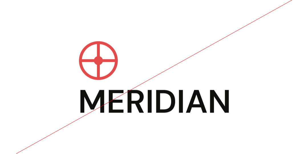
Do not change the color of the mark alone
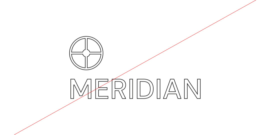
Do not outline the logo
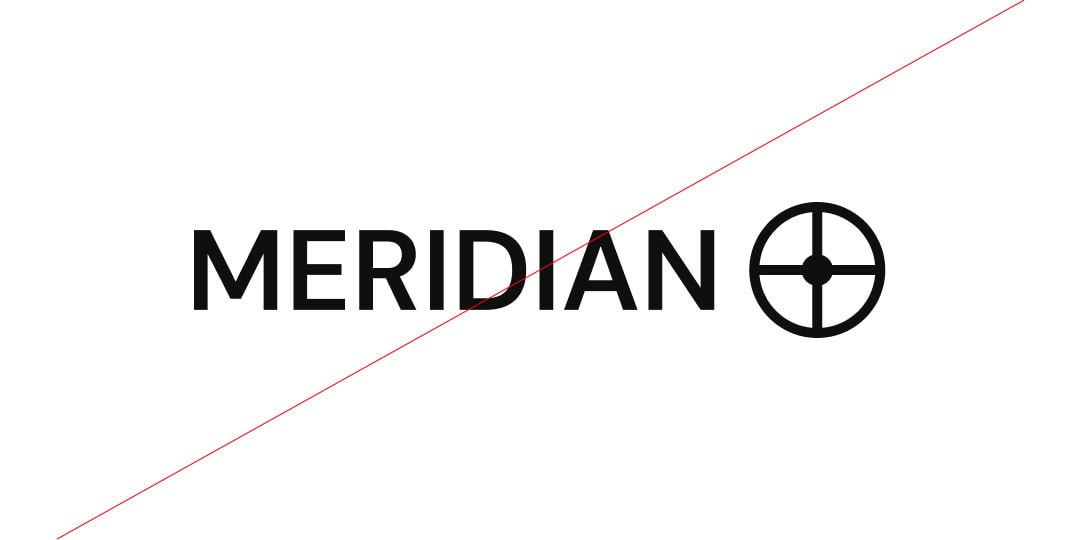
Do not reverse the lockup
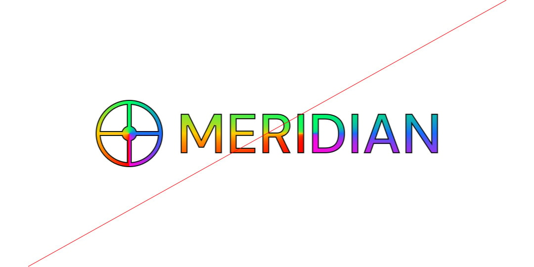
Do not add gradients the logo
Partnerships
04 Color
The palette is built around contrast and restraint. Off-black establishes authority. Lime delivers signal. The neutral ramp controls hierarchy without noise.
Primary Palette
Lime
Hex: #BFFF58
Blue Tint
Hex: #B6C9CF
White
Hex: #000000
Baby Blue
Hex: #C6EBF7
Secondary Palette
Navy
Hex: #1E3D59
Caption
Hex: #48749E
Sky Blue
Hex: #DEEEFE
Off-blue
Hex: #E8EBEF
Lime
Hex: #CD4900
Black
Hex: #000000
Dark Grey
Hex: #A3A3A3
Grey
Hex: #E5E5E5
Gradient Palette

Gradient 1

Gradient 2

Gradient 3

Gradient 4
05 Typography
Meridian's typographic system is built on two typefaces that share a philosophy: legibility without personality sacrifice, precision without sterility.
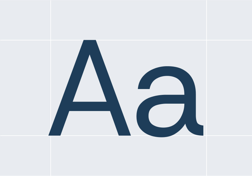
Primary Sans-Serif (DM Sans) is a clean, modern sans-serif typeface that ensures legibility and precision across all digital and print materials. Its geometric structure reflects clarity, efficiency, and trust, making it the ideal choice for data-heavy content, dashboards, and user interfaces.
Secondary Sans-Serif (Inter) is a it was built from the ground up for interfaces — optimised for reading at 13px, tested across dozens of UI contexts, and refined over years of open-source iteration. Where DM Sans carries the brand voice, Inter carries the product. It handles data tables, form labels, error messages, and microcopy with the kind of quiet reliability that lets the content lead rather than the letterform.
Together they create a clear hierarchy: DM Sans speaks, Inter informs. Neither competes with the other because they're doing fundamentally different jobs.
Primary Typeface
DM SANS
Secondary Typeface
INTER
Sizing
Lorem ipsum dolor sit amet, consectetur adipiscing elit, sed do eiusmod tempor incididunt ut labore et dolore magna aliqua. Ut enim ad minim veniam, quis nostrud exercitation ullamco laboris nisi ut aliquip ex ea commodo consequat.
Financial errors shouldn’t slow you down or cause unnecessary stress. Whether it’s an incorrect charge, a duplicate transaction, or a miscalculated fee, we step in to make things right. Our process is simple, straightforward, and designed to get your money back where it belongs—quickly and without hassle.
Type Sizes 0–24pt/px
130% Leading
0% Tracking
Our team works diligently to recover lost funds, correct inaccuracies, and keep your financial records accurate—so you can feel confident about every dollar in your account.
Type Sizes 24–55pt/px
120% Leading
-1% Tracking
Whether it’s a bank error, an unauthorized charge, or an overlooked refund, we ensure you don’t pay for something you shouldn’t have.
Type Sizes 55–72pt/px
110% Leading
-2% Tracking
Clear Up Confusion, Gain Peace of Mind
Type Sizes > 72pt/px
110% Leading
-2% Tracking
06 Art Direction
Meridian’s photography style reinforces our brand’s core values—trust, clarity, and financial empowerment—by showcasing visuals that reflect professionalism, accuracy, and control.

Clean & Casual
Photography should feature modern, well-lit workspaces with a clean and organized feel. The focus should be on clarit, avoiding clutter or overly dramatic compositions.

Subtle Technology Integration
Photography should include elements of financial technology—computer screens displaying dashboards, tablets with data analytics, or hands interacting with financial tools—to highlight Redo’s tech-driven approach to error correction.

Financial Storytelling
Images should capture real-world financial scenarios—professionals analyzing reports, business owners reviewing balance sheets, and teams discussing financial strategies. This reinforces Redo’s role in helping businesses take control of their finances.

People with Confidence & Focus
Images should capture real-world financial scenarios—professionals analyzing reports, business owners reviewing balance sheets, and teams discussing financial strategies. This reinforces Redo’s role in helping businesses take control of their finances.